Noodling on the Volunteer System

Over the last couple days I have been thinking about how to manage the volunteer system.  I suspect most teams are like the MacDolphins and the parents of the swimmers are required to complete some level of volunteering in the plethora of roles required to run a swim meet.  But how do you account for the dramatic difference in time each role requires?

I am leaning toward implementing a system where the roles are defined and then assigned some sort of unit value.  Each parent would be required to volunteer for some team specified units and the system would track how many units people worked.  For example, a timer might be 10 units and pizza selling might be 5 units.  If a parent volunteered as a timer at one meet and sold pizza at another meet, they have completed 15 units of volunteer time.  The units per role could be assigned such that the season long jobs (e.g. chair person) might be worth 50 units.

Just an idea, we’ll see where it goes.
Meet event loading is working!

This afternoon I was able to get event loading working for individual swim meets.  The system allows the definition of a standard set of events.  These events can be loaded into a swim meet to seed the swim meet and then tweaked for the needs of the specific meet (e.g. running the 6 & under groups early).

In the process I fixed a couple other broken things, the most important one being the controls on the GUI Data Lists widgets didn’t work on the ones which had a drop down menu.  Now that the events are loaded, I can start working on bringing the results of a swim meet back into the system

Before I do that, I will probably work on the volunteer system as that is something I need for our own swim team soon.

Dashboard icons updated

Tonight I worked out how to have a different icon in the dashboard when the menu is active, inactive, or hovered over.  This allows me to use a different color icon when active than when hovering over the menu or making it active.  The funny looking icon that was displayed when the menu is active now looks correct.

Restructuring the Menus

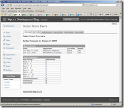
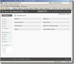
I had some time today to work on the plugin and I was able to get a lot of the menu work completed that has been nagging at me.  I still have a little more to do though.  From the two screen shots below you can see that the icon in the Swim Team top level menu doesn’t look very good when the menu is active.  It looks find when another menu is active.  This shouldn’t be too hard to fix though.

I am pretty happy with the other changes I made.  The most notable being moving the Options tab off the Management page to it’s own page and breaking the huge form up into four separate forms.  The options (aka settings) are all now logically grouped.  I also fixed a couple bugs I encountered as I was testing it.

I also moved the Report Generator off the Management menu into it’s own page as well as I envision having several standard reports available in addition to the Report Generator.

wpstss01 wpstss02

Dashboard Icons

This weekend I decided to start working on the Dashboard Menu.  WordPress 2.7 changes the Dashboard quite a bit and the way I had done the menus previously still worked but wasn’t very intuitive.  As familiar as I am with the plugin, I still found myself hunting for several of the items.

I used to have a top level Swim Team menu but had removed it because it didn’t play nicely with some of the Admin Menu plugins.  2.7 cleans up that problem (I think) and I have added the top level menu back in.  2.7 also supports adding a custom icon for top level menus.  I found a couple of SVG images on Wikimedia Commons that I will probably use with the plugin.

Right now I am using the diver as the icon for the plugin and it looks pretty good!

There is a pretty good write up on how to Top Level Menus and how to Add Icons to the Dashboard on WpEngineer.com.  I found one other explanation but this one is easier to follow.  I had posed a question on the Wp-Hackers mailing list about how big the icon should be but still don’t have an answer.