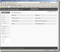
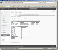
Tonight I worked out how to have a different icon in the dashboard when the menu is active, inactive, or hovered over. This allows me to use a different color icon when active than when hovering over the menu or making it active. The funny looking icon that was displayed when the menu is active now looks correct.
Daily Archives: February 4, 2009
Restructuring the Menus
I had some time today to work on the plugin and I was able to get a lot of the menu work completed that has been nagging at me. I still have a little more to do though. From the two screen shots below you can see that the icon in the Swim Team top level menu doesn’t look very good when the menu is active. It looks find when another menu is active. This shouldn’t be too hard to fix though.
I am pretty happy with the other changes I made. The most notable being moving the Options tab off the Management page to it’s own page and breaking the huge form up into four separate forms. The options (aka settings) are all now logically grouped. I also fixed a couple bugs I encountered as I was testing it.
I also moved the Report Generator off the Management menu into it’s own page as well as I envision having several standard reports available in addition to the Report Generator.

